Not too long ago I designed my very own business cards via MOO.com, a simple website created in mind to let people build their very own business cards and calendars.
I'd looked a couple of other websites previously including VistaPrint but I found that MOO had more to offer for what I was looking for. Below are a few pictures showing what my business cards are all about and why i chose the designs that I did.
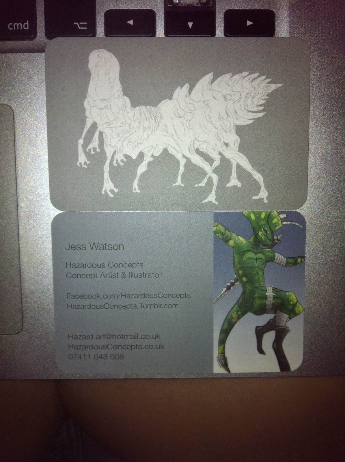
The first design that I chose was a creature I made simply named "Many Leg". When I drew him I really liked the line work so wanted to use him in something, turns out a business card was just the thing! He fit on perfectly and looked beautiful with a nice white body separating him from the grey background.
The second design I chose to include with my cards was another creature I created that I named the "Venator," this creature has the same colour design as the "Many Leg" and the two complimented one another really nicely. Here are both card types next to one another for comparison.
I wanted the inside of the card to be more eye catching where the contact details were so I added a splash of colour and included my "Saurian" dinosaur man on the side which is overall one of my most favourite drawings that I've made on photoshop. I really like the back as it is eye catching and draws your attention immediately in.
This is what my business card looks on each side, the front of the card has the colour design with the details while the back of the card has a more reserved grey and white tone to it. I really like that the business cards aren't overbearing on the eyes and I really am quite happy with how they turned out. I also liked being able to choose from a variety of papers, corners and finishes to get my card just how I wanted it to be.
I'm going to do a separate review about the MOO website and dealing with them as a whole, but to sum it up I would certainly use again.


No comments:
Post a Comment